

Feb 6, 2022
Responsive Design - Optimizing for Mobile and Beyond
Feb 6, 2022
Responsive Design - Optimizing for Mobile and Beyond
Feb 6, 2022
Responsive Design - Optimizing for Mobile and Beyond
Introduction
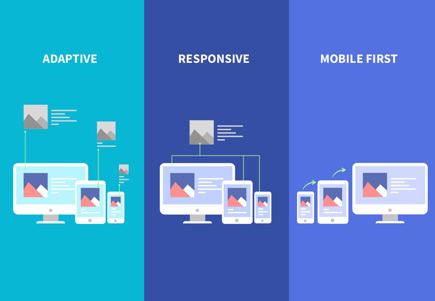
In today's digital landscape, ensuring a seamless user experience across devices is non-negotiable. Responsive design offers a solution by enabling websites and applications to adapt fluidly to various screen sizes and device types. This blog explores the importance of responsive design, key principles to achieve it effectively, and examples of successful implementation.

Importance of Responsive Design
Responsive design addresses the diverse ways users access content, including smartphones, tablets, desktops, and beyond. Key benefits include:
Enhanced User Experience: Consistent usability across devices improves accessibility and satisfaction.
Improved SEO Performance: Responsive sites typically perform better in search engine rankings, as they provide a better user experience.
Cost and Time Efficiency: Developing a single responsive site is often more cost-effective and less time-consuming than creating separate versions for different devices.

Key Principles of Responsive Design
1. Flexible Grids and Layouts
Grid Systems: Use fluid grid systems that adjust proportionally to the screen size, ensuring content remains readable and accessible.
Flexible Images and Media: Employ CSS techniques such as max-width to ensure images and media scale appropriately without distorting or overflowing.
2. Media Queries
Viewport Dimensions: Utilize CSS media queries to apply different styles based on viewport dimensions, optimizing layouts for different devices (e.g., smartphones, tablets, desktops).
3. Content Prioritization
Mobile-First Approach: Begin design with mobile users in mind, prioritizing essential content and functionalities. This approach ensures a streamlined experience across all devices.
Successful Implementation Examples
1. Google
Google's website exemplifies responsive design by adapting seamlessly across devices. The layout adjusts fluidly, maintaining functionality and usability whether accessed from a smartphone, tablet, or desktop.
2. Amazon
Amazon's responsive approach ensures a consistent shopping experience regardless of device. The layout and navigation are optimized for touch interactions on mobile devices while leveraging larger screens for enhanced product displays on desktops.

Case Study: Enhancing User Engagement with Responsive Design
Background
Company: XYZ Tech Solutions
Project: Redesign of Corporate Website
Team:
Lead Designer: Michael Thompson
Frontend Developer: Jessica Lee
UX Researcher: Ryan Davis
Challenges
XYZ Tech Solutions aimed to revamp its corporate website to better showcase its services and improve user engagement. Key challenges included outdated design, lack of mobile optimization, and a high bounce rate on mobile devices.

Approach
1. Research and Planning
Ryan Davis conducted user research to understand how visitors interacted with the current site across different devices. Findings highlighted the need for a responsive design to enhance usability and reduce bounce rates.
2. Design and Prototyping
Michael Thompson led the design efforts, employing a mobile-first approach to prioritize essential content and streamline navigation for smaller screens. He used tools like Figma to create responsive wireframes and prototypes.
3. Development and Testing
Jessica Lee collaborated closely with Michael to ensure seamless translation of designs into responsive web pages. They used CSS media queries and flexible grid systems to optimize layouts for various viewport sizes.
4. Launch and Optimization
Post-launch, Ryan monitored user analytics to evaluate the effectiveness of the responsive design. Key metrics, such as bounce rates and time-on-page, showed significant improvement across mobile and desktop devices.
Results
Increased User Engagement: Mobile users reported improved usability and navigation, leading to a reduction in bounce rates and an increase in page views.
Enhanced Brand Perception: The responsive design conveyed professionalism and accessibility, positively impacting user perception of XYZ Tech Solutions.
SEO Performance: Google's Mobile-Friendly Test confirmed improved search rankings due to the responsive nature of the site.
Conclusion
Responsive design is a cornerstone of modern web development, catering to the diverse preferences and behaviors of users across devices. By implementing flexible grids, media queries, and a mobile-first approach, designers and developers can create websites that not only adapt seamlessly but also enhance user experience and drive business success. As technology evolves and user expectations grow, responsive design remains essential for staying competitive in the digital landscape, ensuring that websites are not just accessible but also enjoyable to use on any device.
Introduction
In today's digital landscape, ensuring a seamless user experience across devices is non-negotiable. Responsive design offers a solution by enabling websites and applications to adapt fluidly to various screen sizes and device types. This blog explores the importance of responsive design, key principles to achieve it effectively, and examples of successful implementation.

Importance of Responsive Design
Responsive design addresses the diverse ways users access content, including smartphones, tablets, desktops, and beyond. Key benefits include:
Enhanced User Experience: Consistent usability across devices improves accessibility and satisfaction.
Improved SEO Performance: Responsive sites typically perform better in search engine rankings, as they provide a better user experience.
Cost and Time Efficiency: Developing a single responsive site is often more cost-effective and less time-consuming than creating separate versions for different devices.

Key Principles of Responsive Design
1. Flexible Grids and Layouts
Grid Systems: Use fluid grid systems that adjust proportionally to the screen size, ensuring content remains readable and accessible.
Flexible Images and Media: Employ CSS techniques such as max-width to ensure images and media scale appropriately without distorting or overflowing.
2. Media Queries
Viewport Dimensions: Utilize CSS media queries to apply different styles based on viewport dimensions, optimizing layouts for different devices (e.g., smartphones, tablets, desktops).
3. Content Prioritization
Mobile-First Approach: Begin design with mobile users in mind, prioritizing essential content and functionalities. This approach ensures a streamlined experience across all devices.
Successful Implementation Examples
1. Google
Google's website exemplifies responsive design by adapting seamlessly across devices. The layout adjusts fluidly, maintaining functionality and usability whether accessed from a smartphone, tablet, or desktop.
2. Amazon
Amazon's responsive approach ensures a consistent shopping experience regardless of device. The layout and navigation are optimized for touch interactions on mobile devices while leveraging larger screens for enhanced product displays on desktops.

Case Study: Enhancing User Engagement with Responsive Design
Background
Company: XYZ Tech Solutions
Project: Redesign of Corporate Website
Team:
Lead Designer: Michael Thompson
Frontend Developer: Jessica Lee
UX Researcher: Ryan Davis
Challenges
XYZ Tech Solutions aimed to revamp its corporate website to better showcase its services and improve user engagement. Key challenges included outdated design, lack of mobile optimization, and a high bounce rate on mobile devices.

Approach
1. Research and Planning
Ryan Davis conducted user research to understand how visitors interacted with the current site across different devices. Findings highlighted the need for a responsive design to enhance usability and reduce bounce rates.
2. Design and Prototyping
Michael Thompson led the design efforts, employing a mobile-first approach to prioritize essential content and streamline navigation for smaller screens. He used tools like Figma to create responsive wireframes and prototypes.
3. Development and Testing
Jessica Lee collaborated closely with Michael to ensure seamless translation of designs into responsive web pages. They used CSS media queries and flexible grid systems to optimize layouts for various viewport sizes.
4. Launch and Optimization
Post-launch, Ryan monitored user analytics to evaluate the effectiveness of the responsive design. Key metrics, such as bounce rates and time-on-page, showed significant improvement across mobile and desktop devices.
Results
Increased User Engagement: Mobile users reported improved usability and navigation, leading to a reduction in bounce rates and an increase in page views.
Enhanced Brand Perception: The responsive design conveyed professionalism and accessibility, positively impacting user perception of XYZ Tech Solutions.
SEO Performance: Google's Mobile-Friendly Test confirmed improved search rankings due to the responsive nature of the site.
Conclusion
Responsive design is a cornerstone of modern web development, catering to the diverse preferences and behaviors of users across devices. By implementing flexible grids, media queries, and a mobile-first approach, designers and developers can create websites that not only adapt seamlessly but also enhance user experience and drive business success. As technology evolves and user expectations grow, responsive design remains essential for staying competitive in the digital landscape, ensuring that websites are not just accessible but also enjoyable to use on any device.
Introduction
In today's digital landscape, ensuring a seamless user experience across devices is non-negotiable. Responsive design offers a solution by enabling websites and applications to adapt fluidly to various screen sizes and device types. This blog explores the importance of responsive design, key principles to achieve it effectively, and examples of successful implementation.

Importance of Responsive Design
Responsive design addresses the diverse ways users access content, including smartphones, tablets, desktops, and beyond. Key benefits include:
Enhanced User Experience: Consistent usability across devices improves accessibility and satisfaction.
Improved SEO Performance: Responsive sites typically perform better in search engine rankings, as they provide a better user experience.
Cost and Time Efficiency: Developing a single responsive site is often more cost-effective and less time-consuming than creating separate versions for different devices.

Key Principles of Responsive Design
1. Flexible Grids and Layouts
Grid Systems: Use fluid grid systems that adjust proportionally to the screen size, ensuring content remains readable and accessible.
Flexible Images and Media: Employ CSS techniques such as max-width to ensure images and media scale appropriately without distorting or overflowing.
2. Media Queries
Viewport Dimensions: Utilize CSS media queries to apply different styles based on viewport dimensions, optimizing layouts for different devices (e.g., smartphones, tablets, desktops).
3. Content Prioritization
Mobile-First Approach: Begin design with mobile users in mind, prioritizing essential content and functionalities. This approach ensures a streamlined experience across all devices.
Successful Implementation Examples
1. Google
Google's website exemplifies responsive design by adapting seamlessly across devices. The layout adjusts fluidly, maintaining functionality and usability whether accessed from a smartphone, tablet, or desktop.
2. Amazon
Amazon's responsive approach ensures a consistent shopping experience regardless of device. The layout and navigation are optimized for touch interactions on mobile devices while leveraging larger screens for enhanced product displays on desktops.

Case Study: Enhancing User Engagement with Responsive Design
Background
Company: XYZ Tech Solutions
Project: Redesign of Corporate Website
Team:
Lead Designer: Michael Thompson
Frontend Developer: Jessica Lee
UX Researcher: Ryan Davis
Challenges
XYZ Tech Solutions aimed to revamp its corporate website to better showcase its services and improve user engagement. Key challenges included outdated design, lack of mobile optimization, and a high bounce rate on mobile devices.

Approach
1. Research and Planning
Ryan Davis conducted user research to understand how visitors interacted with the current site across different devices. Findings highlighted the need for a responsive design to enhance usability and reduce bounce rates.
2. Design and Prototyping
Michael Thompson led the design efforts, employing a mobile-first approach to prioritize essential content and streamline navigation for smaller screens. He used tools like Figma to create responsive wireframes and prototypes.
3. Development and Testing
Jessica Lee collaborated closely with Michael to ensure seamless translation of designs into responsive web pages. They used CSS media queries and flexible grid systems to optimize layouts for various viewport sizes.
4. Launch and Optimization
Post-launch, Ryan monitored user analytics to evaluate the effectiveness of the responsive design. Key metrics, such as bounce rates and time-on-page, showed significant improvement across mobile and desktop devices.
Results
Increased User Engagement: Mobile users reported improved usability and navigation, leading to a reduction in bounce rates and an increase in page views.
Enhanced Brand Perception: The responsive design conveyed professionalism and accessibility, positively impacting user perception of XYZ Tech Solutions.
SEO Performance: Google's Mobile-Friendly Test confirmed improved search rankings due to the responsive nature of the site.
Conclusion
Responsive design is a cornerstone of modern web development, catering to the diverse preferences and behaviors of users across devices. By implementing flexible grids, media queries, and a mobile-first approach, designers and developers can create websites that not only adapt seamlessly but also enhance user experience and drive business success. As technology evolves and user expectations grow, responsive design remains essential for staying competitive in the digital landscape, ensuring that websites are not just accessible but also enjoyable to use on any device.


